ShopDreamUp AI ArtDreamUp
Deviation Actions


Suggested Deviants


Suggested Collections


You Might Like…


Featured in Groups


Description
|About:
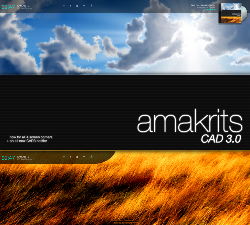
CD Art Display skin designed to go with the Amakrits Suite by *Bobbyperux.
|Inside:4 versions for:
top-left - top-right - bottom-left - bottom-right
8 substyles to fit screenwidths of:
1024 - 1152 - 1280 - 1366 - 1440 - 1600 - 1680 - 1920
|Other:
You can grab the amakrits ICO set from here as well as the PNG set from here.
|Terms of use:
All graphics are copyright © and intented for personal desktop use only. You may not modify and release or redistribute them without *Bobbyperux' permission. These graphics may not be used in any way for commercial purposes.
Thanks for reading and enjoy the skin.
© 2009 Roberto Abril Hidalgo | bobbyperux.deviantart.com

|Clouds: [link] by ~cj-productions
|Golden Grass: [link] by =P0RG
© 2009 - 2024 OtisBee
Comments439
Join the community to add your comment. Already a deviant? Log In
Well, this is my first advanced critique here on DA. And a pleasure, I'm doing it for one of your skins.
Preview: As usual phantastic work here! I know, you spend a lot of time in creating your previews. Amazing presentation!
Installation: Not much to say here, because the .cskin file (which I miss in most new skins) does its job here.
You provided the necessary fonts (Great!). A good and informative solution to install the right resolution skin follows. <img src="e.deviantart.com/emoticons/t/t…" width="15" height="15" alt="
First appearance: When I have chosen my style, the skin starts without the panel. All visible parts are self-explanatory here. Except the "+i" icon. Maybe you should have told in the preview or the description, that it reveals the animated panel. On the other hand, it's a surprising effect, when you click it and the animation starts. Just wanted to mention it, because I noticed that not every user discovers such features.
Design: You both chose a minimalistic style which is fine and offers max clarity. Transparency is too high here in my opinion. And because you did the corresponding graphics this way, there is no room to change transparency in the skin editor.
The skin and all of its elements appear very clean. I like the large time display and the textinformation next to it, just as I like the toolbar and the progressbar beneath.
The animation (which is absolutely smooth!) and the revealing cover graphic is a class of its own. Perfectly done! <img src="e.deviantart.com/emoticons/n/n…" width="15" height="15" alt="
In my opinion, you could have altered the font size on the larger resolution styles. Especially because there is a lot of unused space left in the middle of the skin. The title "Satellite (Live in Hammersmith" for example, starts to scroll. In consideration of the width of the styles, that shouldn't be necessary. Also the informations on the right side aren't readable very good (at least for me on 1920x1200). <img src="e.deviantart.com/emoticons/w/w…" width="15" height="15" alt="
You followed the minimal style with your nocover.png (...) and I must say it looks very good. I must confess, less is more sometimes. <img src="e.deviantart.com/emoticons/s/s…" width="15" height="15" alt="
All in all, this is a very good skin, which I truly like. Most of my so called "Critique" is a matter of taste. Other users may have a completely different opinion here...